6 Hand Lettering Tips for Creating Your Own Greeting Cards

Today’s post is brought to you by my friend Jenn. Jenn lives in Philly and blogs at not only one, but two blogs – Hello Brio (about productivity, design inspiration, and the creative process). Not only that, but she went to a concert with me the first night she met me, so that makes her pretty gosh darn awesome.
I asked her if she would like to do a post about lettering on cards. I’ve been making cards for a while now, but you’ll find that I don’t write too much on the front of the cards – I look for an embellishment, pretty paper, or sticker to take over the center piece, but hopefully after this tutorial you’ll start to see more lettering happen – because it’s really frickin pretty. Take it away, Jenn –
–
When working on any hand lettering project, it’s important to follow a few basic rules when it comes to laying out your letters and phrases. Whether you’re creating individual cards for friends or designing cards for your online shop, follow these quick typography and layout tips to help you achieve a beautiful end product.
Work on your layout on scrap paper

If you have a long or complex quote or phrase that you’d like to put on your card, you’ll want to write it out a few times on a separate piece of scrap paper. This will allow you to find aesthetic balance, size your words appropriately, and choose which words will have the most emphasis.
Start by writing it out in plain handwriting, then rearranging it again and again placing emphasis on different words. Keep working on it and develop it further until you have a sketch that you like the best.
Make conscious margin decisions

Lettering looks awesome if it has a lot of room to breathe, or if it’s bleeding to the edge of the page. But anywhere too close to the edge and it can look like a mistake or an afterthought. When you’re laying out your phrase or quote, decide if you want the words to stay within a strict boundary or if you’re going to want one or more words to look like they’re falling off the edge of the card.
Keep lettering styles to a minimum

In your own artistic repertoire, you may have several lettering styles under your belt. If you have 5, it doesn’t necessarily mean that you should use all five. In my experience, a lettering design can translate to a more successful, cohesive design if it’s restricted to one or two distinct styles.
Choose lettering styles that mirror the emotion
So while it’s a good idea to choose lettering styles that are different in style (sans serif, serif, blocky, script, calligraphy, etc), it will work best if your lettering pairs have a similar feel. These choices will work best to capture the mood of the greeting card if they mirror the overall emotion of the card.
This may go without saying, but fun, whimsical lettering works best with cheery messages, and more strict lettering works best with serious messages.
However, there are always ways to use more strict lettering in a fun way, by constraining it to a fun shape or making the letters fit within each other in a new way.
Keep it legible

No matter what, when you’re hand lettering a greeting card or any message, the main goal is still to communicate a message. Keep your lettering legible and work to develop your design within the constraints of typography. Letter forms are flexible, but only to a point. You don’t want your good intent to be skewed by the recipient trying to decipher your beautifully lettered greeting card.
Keep the coloring simple

Much like you want to keep the lettering styles to a minimum, you will also want to stay within one color palette. Not sure where to start? Drop your favorite color hex code into this Color Calculator and pull a few recommended colors from there.
Bonus tip: Limit yourself and be more creative
A fun exercise is limiting yourself in order to come up with more creative designs. Try using one pen. One lettering style. One color, etc. It’s interesting what you can create with such limitations put on yourself, and often the result can be very elegant.

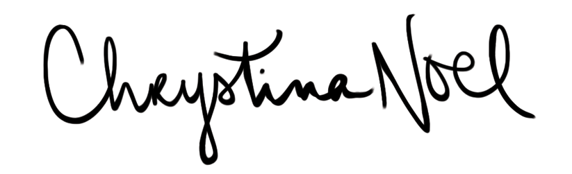
Jennifer Coyle is a letterer, illustrator, UX designer, and blogger. She is the founder of the Lettering League, author of Getting Started wtih Brush Lettering, and owner of Hello Brio, where she builds people-first website solutions for entrepreneurs.
